I redesigned this website over two days with Codex and a lot of screenshot critique. That sounds like a speed story, but the better lesson is about taste.
Fast tools make it easy to produce more interface. They do not automatically make the interface clearer. So the real loop was not “ask the agent to make it cooler.” It was:
- Say what a rushed visitor should understand.
- Ask Codex for a plan before implementation.
- Implement one pass.
- Look at desktop, tablet, and mobile screenshots.
- Remove the parts where the ink did not earn its place.
- Write the lesson back into a heuristics file.
That last step matters. I wanted this to become a teaching artifact for COGS 125, Advanced Interaction Design, where I am a TA in Winter 2026. A lot of students are just starting to use AI to build portfolio websites for course projects. “Make it clearer” or “use better hierarchy” can stay abstract; a living markdown file gives the critique something to hold onto.
The file itself grew gradually through screenshot critique, interface revisions, and distilled design iterations, so it records the process instead of pretending the rules arrived fully formed.
Download the heuristics MD Open the case study
Living design memory
Preview the heuristics
This is the same living markdown file I want students to adapt, critique, and hand to their own AI agents.
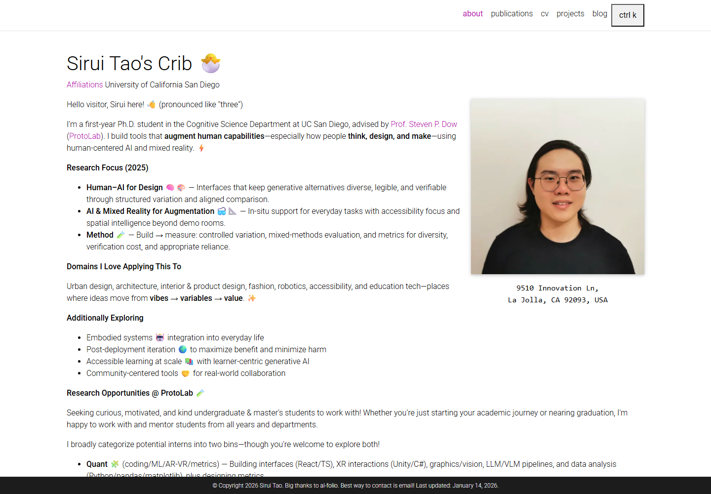
Loading heuristics...The site before the loop
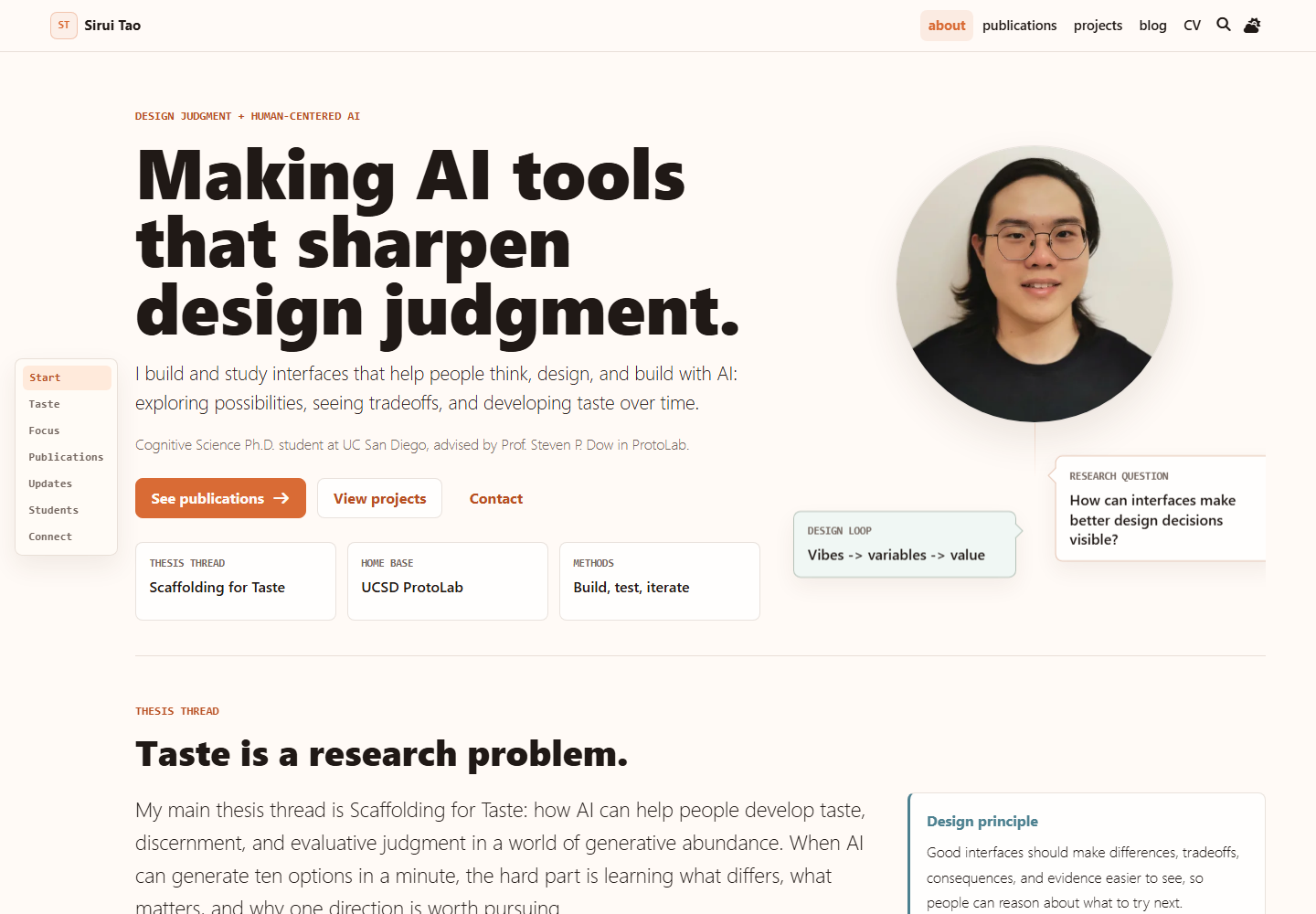
The older site was useful, but it was mostly a container for information. The new version tries to make the story visible sooner: I am a UC San Diego HCI PhD student studying how interfaces can sharpen design judgment, especially in an age where AI can generate many plausible directions quickly.
What the agent was good for
I used Codex with high-reasoning, plan-first implementation loops. The useful thing was not outsourcing taste. The useful thing was making iteration cheaper: more variants, faster screenshots, more chances to notice what felt wrong.
Donald Schon writes about the reflective practitioner as someone who thinks through action. That framing fits this kind of work surprisingly well. You make a move, the material talks back, and then you reframe the next move. In this case, the material was the website: awkward line breaks, a bubble covering my face, a motion section becoming too dominant, a blog page that felt narrower than its purpose.
What changed
The biggest design rule became: every ounce of ink should matter. Color should mean action, state, or grouping. Motion should explain what changed. Whitespace should manage cognitive load, not create mystery.
The homepage now starts with the research claim and routes people to publications, projects, blog, and contact.
The research sketch maps to design, evaluate, and situated modes instead of being an unrelated animation.
The markdown file records the critique so future agents and students can start from better taste.
Follow-up: play with receipts
After the first redesign, I kept pushing on the pages that still felt too quiet. The projects page got an IKEA-inspired card opening pattern: one project expands in place, the grid stays visible, and the visitor can inspect an artifact without feeling thrown into a separate product page too early.
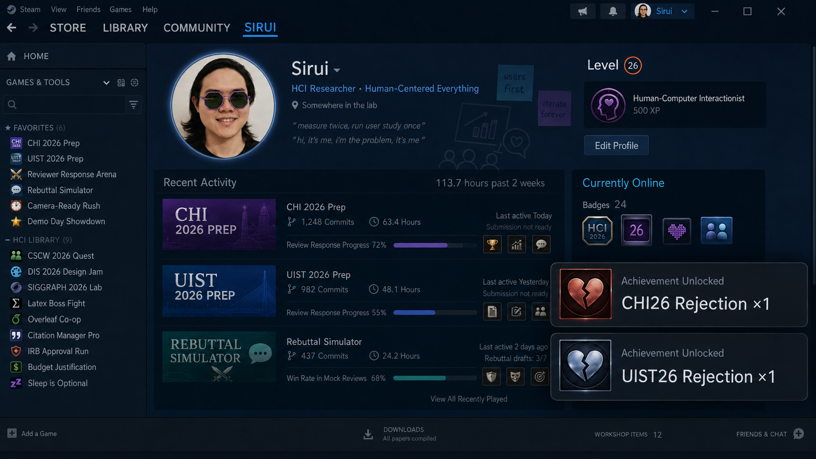
The publications page got the weirder experiment: a Wall of Rejection. It is rejection-only: short Steam-ish badges, click-to-open receipts, and a nerdy Spooder-Man XP joke from my post-UIST 2026 rejection mood. It is not a review-activity dashboard. It is a tiny celebration of failure as part of research life.
This is also where GenAI felt creatively useful. I could hand the agent a messy vibe, then use the design heuristics to pull it back toward the site: restrained motion, clear evidence, theme-aware color, and playfulness that does not drown out the bibliography.
Note to future me: not sure if this is taste, but I had great fun.
Credit where credit is due
I was also borrowing from people and artifacts I admire. The AI in Design 2026 report helped frame the moment: infinite output makes taste and craft more important. Katie Dill says, “AI is sparking a creative renaissance in design.” Stripe’s site was useful as a pattern reference for calm motion, crisp hierarchy, and compact controls.
The point is not to copy them. The point is to notice the underlying practice: make the claim legible, put proof near the claim, and let details increase trust.
The lesson for students
If you give an AI agent vague taste, you usually get vague interface. If you give it constraints, screenshots, critique roles, and a living heuristics file, you get a much better collaborator.
So my recommendation is simple: do not just prompt for prettier. Build a small design memory. Use it to critique. Then keep revising until the page is clearer, not merely louder.
Sources and inspirations: AI in Design 2026, the Craft chapter, Stripe, Katie Dill at Stripe Sessions, IKEA PS 2026, the local Wall of Rejection mockup, the Spooder-Man trailer reference, Donald Schon’s The Reflective Practitioner, and this Wayback snapshot of the old site.