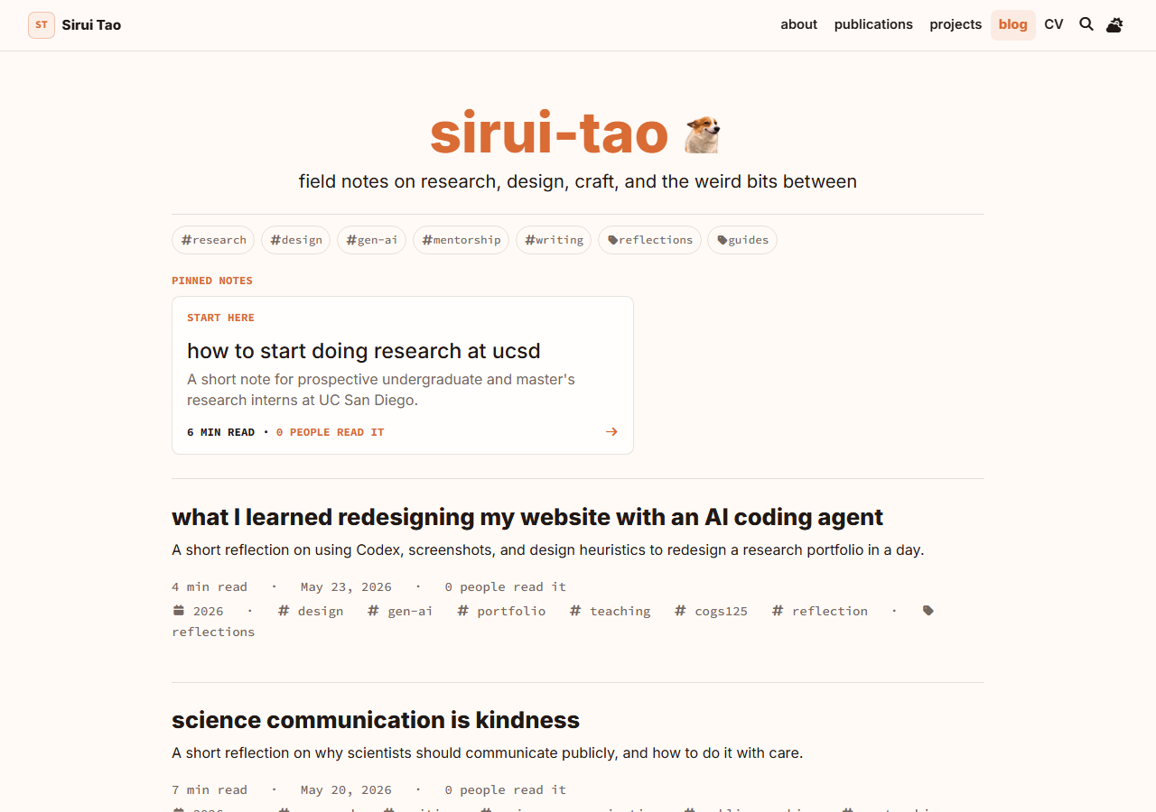
Personal site redesign - COGS 125 teaching artifact
Vibe-Coding a Research Portfolio
I redesigned this portfolio over two days as a small reflective-practice experiment for COGS 125 students: use an AI coding agent for speed, then use design judgment to decide what deserved to stay.

How can a personal academic website quickly teach visitors who I am, what I study, and where to go next while becoming useful for students?
Work in loops: plan, implement, screenshot, critique, remove what feels decorative, and record the durable rule.
A warmer research-first portfolio, a four-theme system, and a reusable heuristics file design students can adapt for their own AI-built portfolio sites.
Before, after, and why it changed
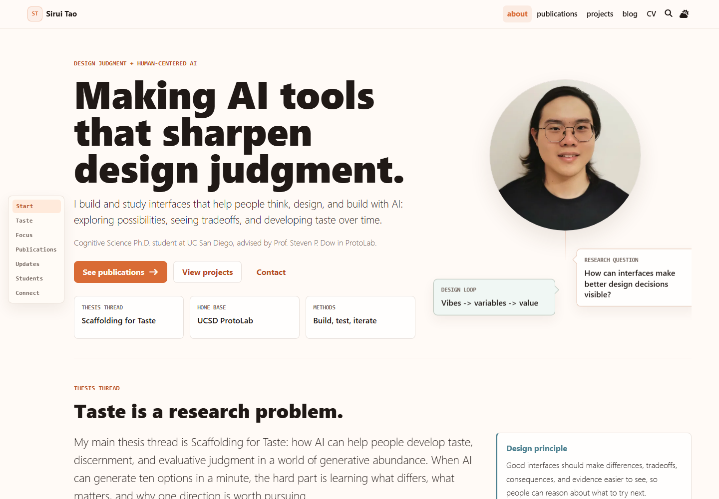
The old site did its job, but it asked visitors to assemble the story themselves. The redesign tries to make the first glance more generous: research thesis first, proof close to the claim, and fewer visual elements that exist only because they look cool. I also wanted the process to be useful for my COGS 125: Advanced Interaction Design students in Winter 2026, especially students who are just starting to use AI to build portfolio websites for course projects.
Follow-up: playful proof above the fold
After a student portfolio exercise, I revisited the hero through Jackie Hu’s portfolio as a motion reference. The useful lesson was not doodle styling; it was how tiny hover states can make a page feel more discoverable. The updated hero keeps the original research-card language, shifts the cards toward quiet paper artifacts on a messy research desk, and gives the portrait one playful meme-record state. The rule stayed conservative: thesis first, personality second, a tiny visible inspiration credit, and any sound behind an explicit play button with original generated tones only.
Taste as a loop
The most useful part of working with Codex was not that it could generate code quickly. It was that speed created more chances to practice judgment. I used Codex with high-reasoning, plan-first implementation loops: make a plan, implement a small pass, inspect screenshots, critique the page from several visitor roles, then simplify.
That loop is close to Donald Schon’s idea of the reflective practitioner: the designer acts, sees what the situation says back, and reframes the next move. In this project, the website itself became the material talking back.
The homepage now says the research thesis before asking visitors to parse a long biography.
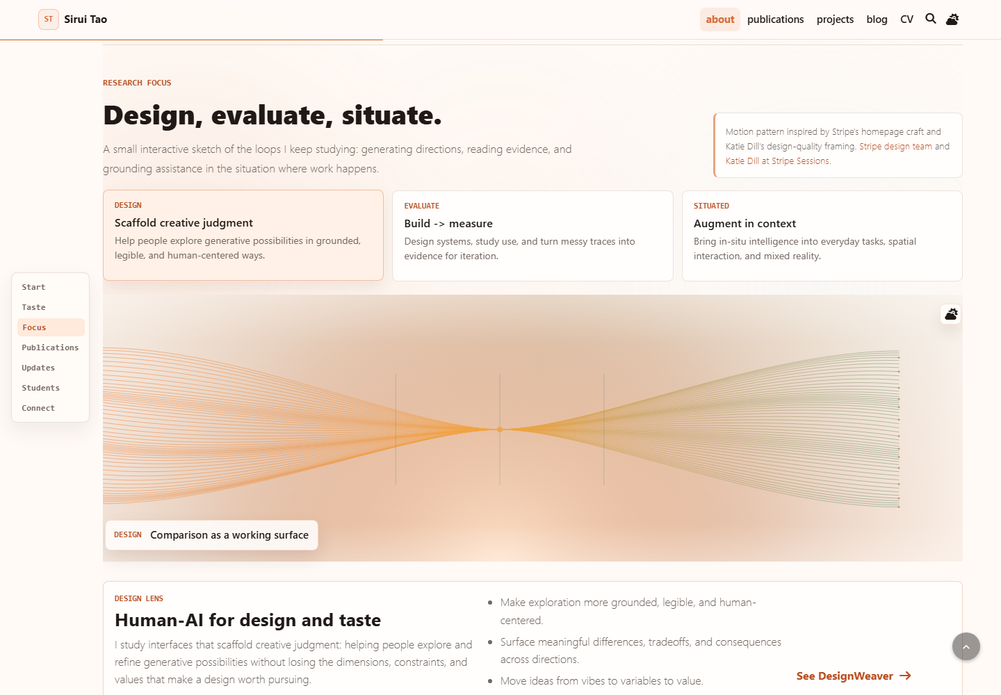
The interactive sketch maps to design, evaluation, and situated assistance instead of acting as decoration.
Every critique that survived became part of a living heuristics file for future design sessions.
The motion sketch
Stripe’s homepage inspired the restraint: a compact control, a proof-like visual, and a calm relationship between claim and interaction. Katie Dill’s craft framing and the AI in Design 2026 report helped sharpen the bigger point: when AI makes output cheap, taste, critique, and judgment become more important.
Interactive artifact
Play with the motion system.
This is the same small research sketch from the homepage: change the research lens, then change the time-of-day theme to see how motion, color, and hierarchy stay connected.
Showing the Design motion sketch. Turn possible directions into a comparison people can reason with.
Human-AI for design and taste
This lens treats interface design as scaffolding for judgment: make the space of options legible enough that students can see what changed and why it matters.
- 01
Turn vague vibes into inspectable variables.
- 02
Keep alternatives comparable before critique.
- 03
Use motion to show gathering, comparison, and reopening.
Evidence before iteration
This lens asks what the artifact taught us after use: which traces, failures, and reactions should change the next version.
- 01
Show probes and measures without making the page feel like a dashboard.
- 02
Connect speed with critique and reflection.
- 03
Keep evaluation close to the thing being evaluated.
Context changes the shape of help
This lens keeps the interface grounded in the actual situation where people act, not only in a clean abstract workflow.
- 01
Draw anchors for people, tasks, tools, and spaces.
- 02
Let pointer motion suggest context without snapping.
- 03
Keep assistance calm enough to stay usable.
Motion note Inspired by motion craft from Stripe's design team and Katie Dill at Stripe Sessions.
Follow-up: play with receipts
A later pass made two quieter pages more alive. The projects page borrowed the opening-card rhythm from IKEA’s PS 2026 story: click a project, let it expand in place, keep the surrounding grid as context. It felt right for an academic project browser because the visitor can inspect one artifact without losing the rest of the collection.
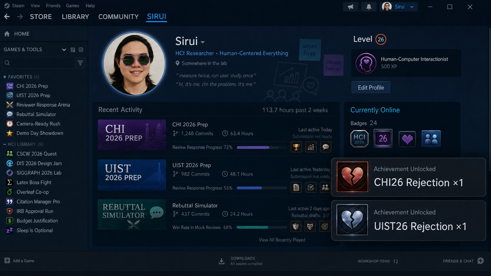
The publications page went in a stranger direction: a small Wall of Rejection above the bibliography. It is rejection-only: short Steam-ish badges, click-to-open receipts, and a nerdy Spooder-Man XP joke from my post-UIST 2026 mood. The goal is not to track review productivity. It is to celebrate failure as part of research life without making the page feel like a leaderboard.
This is one of the moments where GenAI felt most creative to me. I could describe a half-formed joke, then use screenshots and the heuristics file to keep the joke native to the site: evidence close to the claim, restrained motion, theme-aware color, and no generic gaming skin.
Note to future me: not sure if this is taste, but I had great fun.
Use the heuristics
The reusable part is the markdown file. My hope is that students in COGS 125, or anyone redesigning a portfolio, can give it to their own agent and ask for a critique pass grounded in the same design values. Preview it here before downloading; it should stay a living document as the site keeps changing.
That file was built gradually during the redesign, distilled from my critiques, screenshot notes, and interface iterations where the site pushed back and made a design rule clearer.
Living design memory
Website design heuristics
A living markdown checklist for critiquing portfolio pages with clarity, restraint, and reflective practice.
Loading heuristics...Credits
This redesign borrows ideas, not assets, from work I admire: the AI in Design 2026 report, Katie Dill’s writing and talks on craft, Stripe’s interaction design, Jackie Hu’s portfolio motion craft, and Donald Schon’s reflective-practice framing. The point of credit is not formality. It is a design habit: know where your taste came from.