Site experiment · first seen May 27, 2026
The IKEA Card Experiment
Click a project card and it opens right where it was. You can read the full preview without losing the projects around it, then close it and return to the same card.
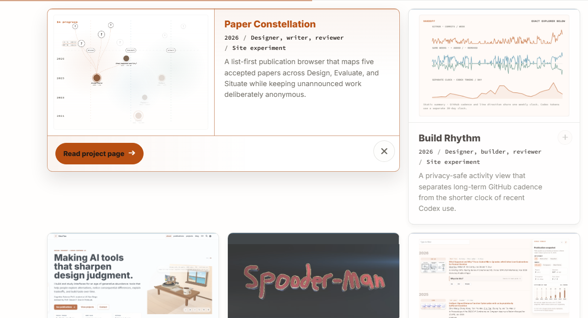
b51609f0d · captured Jul 16, 2026 · 1200×650 · light theme · expanded state · source viewport not retained Opening a separate page made it too easy to lose the collection and forget which project you had chosen.
The selected card expands inside the grid while the neighboring projects remain visible.
The first version squeezed the text and images. Now the card moves without scaling, and interrupted clicks settle cleanly.
Why opening in place mattered
The IKEA PS 2026 collection story gave me the basic idea: let one object open where it already lives while the rest of the collection stays in view. On this portfolio, the animation should help people track the same card—not turn opening a project into a product launch.
What the interaction does
The card starts in the grid, opens in that spot, and stays recognizable while everything settles. Try the live project browser for the interaction; the three frames below show the mechanics without replaying the motion.
01 · Collapsed
Same footprint
Every card starts at the same compact size in its group. A quiet plus says there is a longer preview to open.
02 · Moving
Translate, then reveal
The card becomes open first. One 430 ms clock moves the cards without scaling, while a clip reveals the new content.
03 · Open
Wider, still in place
The selected story gets more room while its neighbors keep the collection visible. Close, Escape, and focus return all end at the same card.
9fa9403e4 interaction; it remains readable with reduced motion.What changed
-
First build ·
15d94c048The first in-place transition
The first pass measured every card before and after opening, then translated and scaled the whole card toward its old rectangle. People could follow which card opened, but the scaling squeezed its text and images.
-
July rethink ·
fc5b8a444→192bcc00cMore signals, then less motion
I added accents, takeaways, image zoom, content keyframes, and smooth scrolling. They competed for attention, so the July pass removed the uneven scaling and kept only a cancelable translation.
-
Current behavior ·
9fa9403e4One cancelable clock
The opening clip now shares the same clock, and the extra keyframes and image zoom are gone. A new click cancels stale motion, while reduced motion jumps to the same final layout immediately.
Full technical revision record
-
15d94c048Introduced the in-place card preview and first FLIP layout transition. -
ee95cc681Added keyboard focus movement and recovery when a preview closes. -
fc5b8a444Added project-specific accents and short takeaways, but also layered several competing motions. -
c363fda85Made announcements and hidden-control focus recovery deterministic. -
192bcc00cReplaced scale-based FLIP with a cancelable, translation-only layout pass and added interruption, focus, and reduced-motion checks. -
9fa9403e4Put the opening clip on the same clock, removed competing content keyframes and image zoom, cleaned up finished WebKit animations, and verified 44-pixel actions across the responsive matrix.
Replay note: I attempted 15d94c048 in a detached exact-commit worktree on Jul 16, 2026. Its pinned historical Docker/Jekyll environment did not finish a build within a bounded four-minute run, leaving no faithful page to inspect or capture.
The accepted refinement removes nonuniform content scaling, sibling shrink, expanded-image zoom, staggered content keyframes, and the double scroll correction. Closing changes the semantic state immediately; the ordinary collapsed-card hover lift remains.