projects
Research artifacts, prototypes, and studies that make questions concrete. Open a card to inspect the artifact, contribution, and links.

What Happened and Why?
A CHI 2026 workshop position paper about trace-guided micro-episodes and in-flow user explanations for product iteration in AI-supported design tools.
What to notice
- Trace data needs user intent.
- Micro-episodes capture why in flow.

HotSpot
A neural SDF optimization framework with a screened Poisson objective for more stable surface reconstruction.
What to notice
- Screened Poisson objectives stabilize SDF optimization.
- Surface reconstruction improves under noisy geometry.

DesignWeaver
A prompt-design workspace that surfaces visual dimensions so novices can make more deliberate product concepts.
What to notice
- Prompts become visible design dimensions.
- Novices compare and iterate deliberately.

Physion
A benchmark for testing whether vision models predict physical scene dynamics the way people do.
What to notice
- Models predict physical scene dynamics.
- Human judgments anchor plausibility.

Context-Aware Encoding for LLMs
A tree-of-thoughts context encoding experiment for improving retrieval and long-document contextual understanding.
What to notice
- Tree structure organizes long context.
- Retrieval becomes easier to inspect.

GraphHSCN
A graph neural network architecture prototype for modeling long-range interactions in structured data.
What to notice
- Graph structure models long-range interactions.
- Prototype explores structured-data reasoning.
A CHRONOLOGICAL DESIGN RECORD
Site experiments
I keep these site experiments on record so newer models can re-review the last best pass—and I keep only changes that survive screenshots, accessibility checks, and my own judgment.
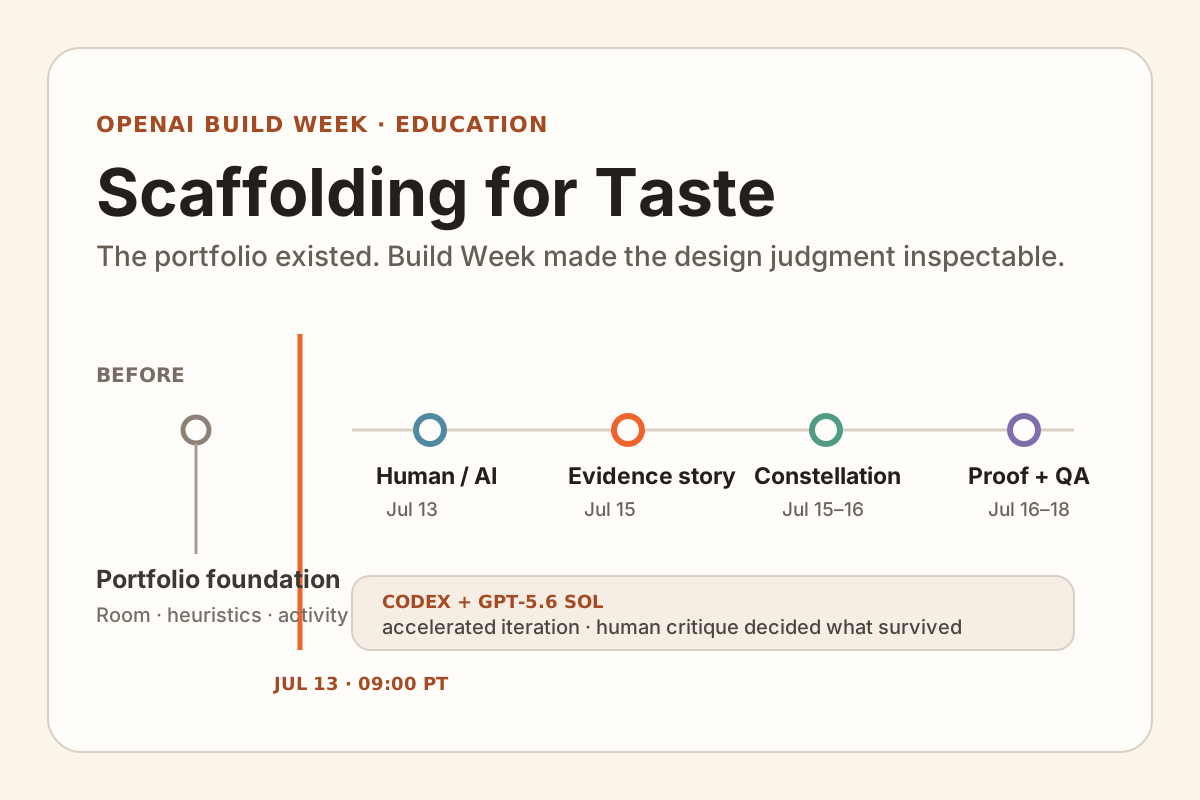
What I added to an existing research portfolio during OpenAI Build Week, with a clear cutoff, linked commits, and reusable project guides.
Why it began
Most of the portfolio existed before Build Week. I needed to show exactly what changed during the event.
What changed
I marked the cutoff on the timeline, then linked each change to the page and commit where it appears.
Intended outcome
Students can inspect which changes survived review and reuse the same screenshot checks on their own pages.
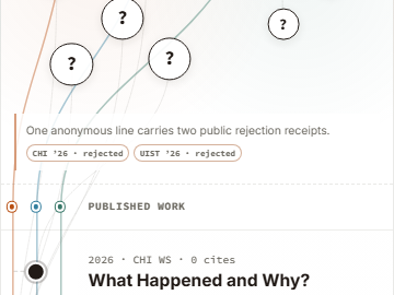
A second way to browse my publications: five accepted papers connected by three recurring research threads, with future work kept anonymous.
Why it began
A year-by-year paper list hid the questions that recur across projects.
What changed
I mapped three recurring research questions on desktop; mobile follows the same papers through time instead of shrinking the map.
Intended outcome
Readers can follow one research question across papers instead of reading the bibliography year by year.
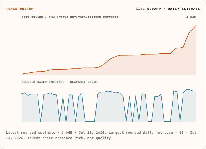
A page for seeing when I build: personal GitHub days, completed personal agent usage, and this site's separate daily token estimate.
Why it began
The logs had totals, but they did not show when the work arrived in bursts.
What changed
A later dashboard mixed unlike numbers. I split it into weekly code changes, daily site-build estimates, and one dated lifetime total.
Intended outcome
Readers can see when work clustered without mistaking GitHub activity, site-build estimates, and lifetime usage for one metric.
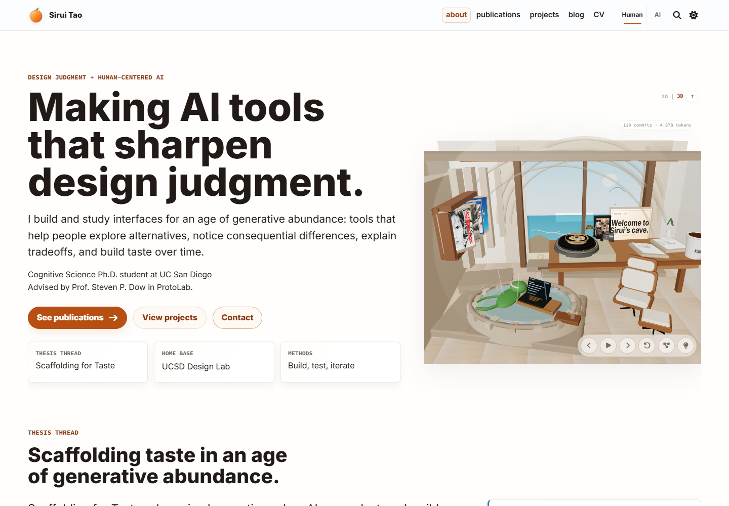
How the homepage's paper collage became an explorable cliff room without losing the same desk, records, and discoveries.
Why it began
The flat desk held papers, records, and hidden cards, but visitors could not step inside the room.
What changed
I made 2D and 3D views of the same room, so music and discoveries remain when someone switches views.
Intended outcome
Visitors can skim the research in 2D, explore the room in 3D, and switch without losing their music or discoveries.
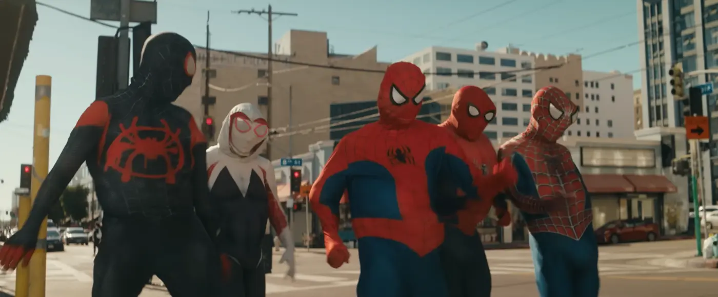
How two paper rejections became a Steam-style lab meme, a remix gallery, and a downloadable prompt-and-image kit.
Why it began
The same paper was rejected by CHI and UIST, then became a Steam-style image passed around the lab.
What changed
A one-off Steam-style meme grew into a small remix kit, with the serious rejection record still one link away.
Intended outcome
The page gives people images and prompts they can actually remix.

Filters and linked highlights that help readers follow one paper across my bibliography, citation total, and annual citation bars.
Why it began
A highlighter suggestion made me notice that each paper's bibliography row, citation count, and yearly bars were far apart.
What changed
Selecting DesignWeaver now highlights its bibliography row, lifetime citation chip, and yearly bars together.
Intended outcome
Readers can follow one paper from bibliography entry to citation history without hunting across the page.
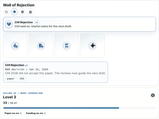
The Steam-style rejection meme I turned into a small public wall of badges, receipts, and deliberately silly Failure XP.
Why it began
Two conference rejections became a lab meme worth keeping instead of hiding.
What changed
The meme became a wall where each rejection gets one dated badge and receipt, without being counted twice in the combo.
Intended outcome
Visitors can see the rejected attempts around accepted work and open the dated receipt behind each badge.
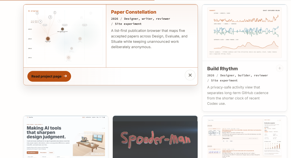
Click a project card, read the full preview in place, then close it without losing your spot in the collection.
Why it began
I wanted project previews to open inside the grid so visitors could keep seeing the other projects and return to the same card.
What changed
The first transition scaled the whole card and squeezed its content. The current version moves the card without scaling its contents and cancels cleanly when another card opens.
Intended outcome
Visitors can sample a project and return to the same place in the collection without a navigation detour.
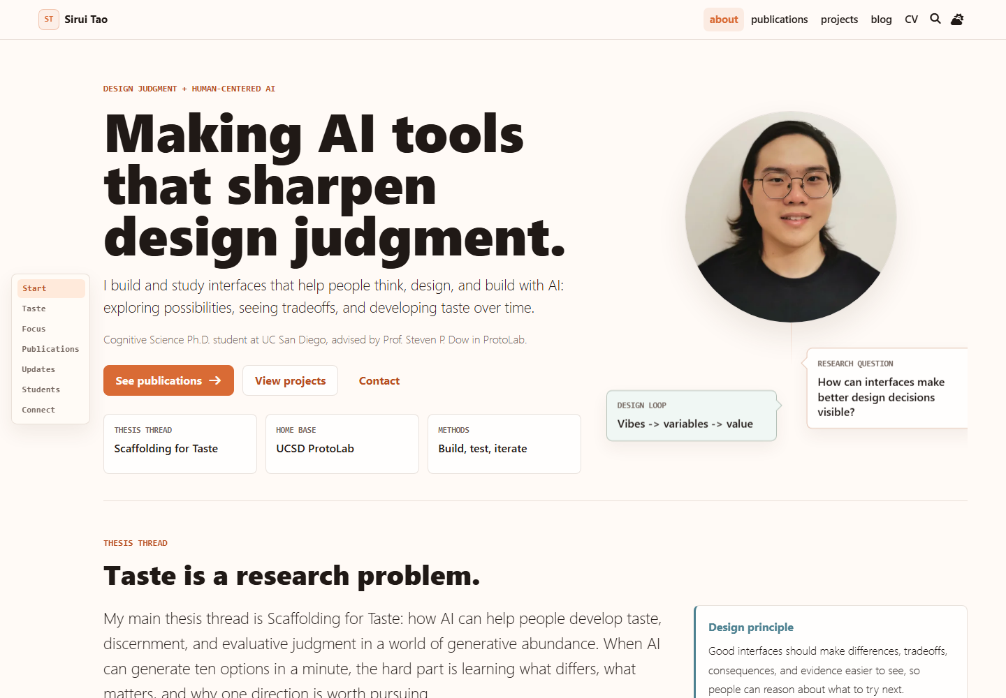
How I rebuilt an academic archive so visitors can find the research question, inspect the work, and reuse the design lessons.
Why it began
My old portfolio listed projects and papers, but visitors could not see what I study or where to start.
What changed
I reorganized the archive around my research questions, then kept the useful experiments as reusable site rules.
Intended outcome
Visitors can see the research thread without reconstructing it.

Find the dog by the blog title, choose a fruit, and see whether it lets you through—without exposing what waits behind it.
Why it began
A meme dog in the blog became a small clue for readers curious enough to follow it.
What changed
The clue became a short fruit-choice game with an obvious way back and a consent step before precise location.
Intended outcome
The clue is optional, and the way back stays obvious.
Other playful builds

A small VRChat world where one person drives, one rides along, and everyone else watches the chaos.
Why it began
I wanted three people to share one VR joke: one steers badly, one rides along, and one watches from outside.
Intended outcome
Driver, passenger, and spectator get different parts of the same joke.
Interaction note: card opening pattern inspired by IKEA's PS 2026 collection story; adapted here for an academic project browser.